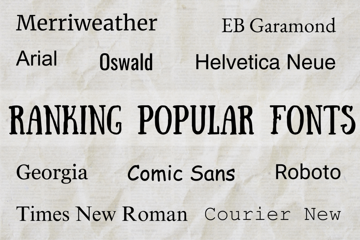
After creating a new document, one of the first things that many people do is change its font. While selecting the right font to achieve a cohesive design is up to personal preference, here’s a ranking of some of the ten most popular fonts with reasons behind each decision:
- Oswald
Oswald would look good on a billboard or a restaurant menu, but it’s simply too stylized for practical use. The distinctive bold, thin letters compromise the heavy stylization with a serious undertone. The font was designed to look trustworthy and efficient, but the horizontally compressed letters are not comfortable to look at, and it isn’t as efficient as it seems since the letters aren’t easily distinguishable from afar.
- Comic Sans
Comic Sans is easily the most controversial font, and it isn’t hard to understand why: its unsure, wobbly lines are the epitome of childlike informality. But most of the hate for this font arose from its frequent misuse in formal contexts. When used correctly in text boxes or short passages, it looks friendly, quirky, and even visually appealing. While its range is severely limited, it has the potential to look lovely.
- Arial
Common and convenient, Arial is a good default font, but captures the main issue with clean, modern, and simple sans serif fonts: it’s too generic. Including Arial text in a graphic looks out of place; its complete lack of little unique details that comprise the personality of a font make it uninteresting to look at and use.
- Merriweather
There’s nothing majorly wrong with Merriweather; it pairs well with modern screens and the large, slightly condensed letters allow writers to fit important information into the document without looking crowded. Although it’s a good choice for online sites, nothing makes it stand out and the lines take up a lot of vertical space.
- Roboto
Roboto is a readable minimalist font with a geometric design, including rounded edges that make it look friendly. Although the lack of sharp edges or any other obvious stylization could make it boring, the lack of serifs or clear edges contributes to its uniqueness and benign appearance.
- Times New Roman
Times New Roman is one of the classics – and usually one of the first fonts available after purchasing a new computer. Its popularity makes sense, given its neat and sensible look that is both efficient and easy to read. It’s also considered professional, and is a very safe choice for official documents. However, its popularity also detracts from its ranking. Since it appears in so many research papers or applications, it has become overused and unoriginal, and the condensed letters make it easy for readers’ eyes to skim over walls of text without retaining any information. One common criticism of Times New Roman is that it looks outdated, unlike more modern-looking sans serif fonts such as Helvetica Neue, but this adds more personality to the font, rather than making it more boring.
- Helvetica Neue
With clean and efficient lines, Helvetica Neue gained popularity for its legibility, as well as its association with modernism and sophistication. At first glance, it looks similar to Arial, but leaves less white space, emphasizing the text and making it less boring and more satisfying to look at. Although it looks a little generic, its neutrality works in its favor to create one of the best sans serif fonts to exist.
- Courier New
Courier New is perhaps the most satisfying font to type in – it feels like using a typewriter, which makes it fun to type stories quickly. And just like all fonts within the Courier typeface, it is monospaced, meaning that each character takes up the same amount of horizontal space. This makes large bodies of text much easier to edit. But sometimes, this font’s high stylization can be a drawback: it can seem over-the-top and distracting after a while, and doesn’t conserve as much space.
- EB Garamond
Neat, light, and elegant, without looking too boring, EB Garamond is a quiet font that evokes classical literature. It is formal enough for essays, but not too formal for personal projects. EB Garamond’s one drawback is its poor legibility. Due to the small, light letters that make it so distinctive, it sometimes looks blurry and hard to read. The small lowercase letters emphasize the uppercase letters, which helps a little, but overall, it should only be used at larger sizes.
- Georgia
Georgia was created in 1993 to increase ease of reading, both on paper and on screen. Its design perfectly fulfilled this goal – it can be easily skimmed and is relaxing on the eye. Other than its practical nature, its small flourishes make it more beautiful and complex than many sans serif fonts, such as Roboto and Helvetica Neue. Despite its uniqueness, which makes it more interesting than Times New Roman, it carries a familiar feel and isn’t too over-the-top to be used in English essays and creative writing projects.

