The New Google Icons Need a Fix
Ever since the world crossed over into this new decade, many companies have begun abandoning the iconography of the old 2010s, and in some cases, the results are decent. While the old faux-3D style known for its appearance on app icons still appeals to me on a personal level to this very day, I am still happy with the new flat designs used as website icons, app pictures, and promotional material. However, a few companies have gone way too far, and created a boring, far too minimalistic, and in some cases, physically hard to look at, style.

The beginning of the downward spiral started with the main face of many companies; their logos.
Compare the cool, heavily stylized look and the distinct 3D shapes that pop out. Many of these older logos almost feel real, in part due to their texturing and material work. The Warners Bros. logo, in particular, feels like it could be a real structure (It actually is!). The BMW and Volkswagen designs are real, solid objects, even found on their cars. While not as intricate as it’s contemporaries, the Revolut logo has a sense of depth that you just don’t find in a logo that’s as simple as a wall of text.

Looking at the effects of the new design, the change that has transpired to these once great iconographies is nothing short of a travesty. Anyone could draw these on paper, particularly the new Revolut logo, which is straight up just a font. All depth is lost, and now these are nothing more than meaningless, fake lines and colors. These logos lose so much meaning that they become indistinguishable from others similar to them.
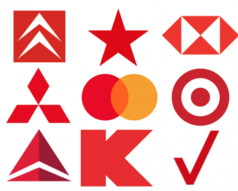
Take a look at this collection of 9 bland designs, all from wildly different companies, mind you. Yet, everything becomes a blur to the mind’s eye. They are so non-descriptive and abstract that if you weren’t already highly aware of certain designs, they would convey almost nothing about the company. In fact, some of these logos are so featureless and simple that they cross the line into a complete disconnect from the company they’re trying to represent. Who in their right mind is going to look at a singular red star and instantly know what brand it’s trying to remind you of. Furthermore, the more minimalistic these redesigns get, the less creative they become, promoting nothing but mindless colorful shapes that vaguely resemble the masterpieces they used to be.

However, no matter how terrible logos can become, they are pale compared to the modern war crime of the new Google icons.
First off, once again, every smidge of unique detail is completely removed. The old designs had unique little folds that acted as a compromise between the old 3D style and the dull, flat look. It almost emulated a paper origami sort of look, which works exceptionally well for the old Gmail icon, representing a letter. Now, the entire design has been reduced down to awful shapes and transparencies, and the same colors are present in every single icon. The lone ‘graphic designer’ tasked with this abomination of human creation must have thought it’d be ‘cool’ to make everything match up. Still, in making this ungodly awful decision, they completely ignored what might probably be the most important rule: ease of use. Taking a quick glance at the new icons, they all blend in a rainbow mess, with the Calendar and Meet ones being particularly inadequate. There is a legitimate chance that the camera ‘prominently’ featured on the Meet icon is straight up just the Calendar rectangle rotated and shrunk, and then outfitted with a camera lens. However, the most disgusting icon of them all is the new Gmail one, which I would argue to be one of the greatest icons of all time, but yet went from an origami-esque masterpiece to the hellspawn of a literal M. And to rub even more salt into the proverbial wound, Google didn’t even change every single icon! More than half of all their tools have had little to no change. Some were indeed altered, but only to a degree so slight that it’s almost a tease, as if they wanted to just slightly mess with your mind, but only in a mildly infuriating way. Google Classroom, arguably one of the most used Google tools in today’s corona-laced times, has had no change! And they didn’t even match up the color scheme correctly!
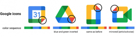
Every different icon has a new random sequence of colors! And yet, they still seem so similar. This absolute herculean trash fire wreaks havoc on your eyes so effortlessly and efficiently that it almost seems like a study of some sort. What kind of human being would legitimately make decisions this incredibly bad? Well, Google must not be human anymore, because they also changed all their document-based tool icons. And guess what?

Once again, they have a completely different style! All of these bar the poor Google Keep icon, which randomly got brought into the mix, are more or less the same as their pre-death counterparts, except they refused to do the rainbow shenanigans, but at the same time did the weird transparency fold in the corner. They acknowledged the main flaw of their other logo changes, yet added changes from those masterpieces of human folly to these, and still have not fixed the worse-off icons, all at the same time! Truly a perfect storm of mishaps and mistakes.
Sure, there are some benefits to the new minimalistic mindset; logos are much less intricate, which is terrible for creativity and expressiveness, yet easy to reproduce on signs and less taxing on printer ink. But all of these improvements are on the company side, bar none, leaving the consumer to be consistently confused at what in God’s name they’re being forced to look at. Thankfully, there is a 3rd-party Chrome extension that reverts many of the icons to their original, iconic, much better-designed counterparts, but it isn’t perfect, as it doesn’t cover everything. A much better solution would just be for Google to revert all of the icons back, or at the very least acknowledge their terrible crimes against humanity (this one at least). I, for one, would be thrilled to see that wonderful Gmail icon back on my screen, right where it belongs.
Now, more than ever, the education of young journalists with integrity is critical to our democracy. Westwood Student Press works hard to bring you award-winning coverage of our school and community. Please consider showing your support for the student journalists of Westwood High School by making a donation in any amount. Your contribution will allow us to purchase equipment and cover our annual website hosting costs.

Class of 2023
I like to eat, sleep, inhale oxygen, and occasionally run and swim. I used to live in Shanghai, I own 9 pets, and I play a metric ton...